import pandas as pd
import matplotlib.pyplot as plt
import numpy as np

%matplotlib inlineScores
Introduction:
This time you will create the data.
Exercise based on Chris Albon work, the credits belong to him.
Step 1. Import the necessary libraries
In [1]:
Step 2. Create the DataFrame that should look like the one below.
In [2]:
raw_data = {'first_name': ['Jason', 'Molly', 'Tina', 'Jake', 'Amy'],
            'last_name': ['Miller', 'Jacobson', 'Ali', 'Milner', 'Cooze'],
            'female': [0, 1, 1, 0, 1],
            'age': [42, 52, 36, 24, 73],
            'preTestScore': [4, 24, 31, 2, 3],
            'postTestScore': [25, 94, 57, 62, 70]}

df = pd.DataFrame(raw_data)
df| first_name | last_name | female | age | preTestScore | postTestScore | |
|---|---|---|---|---|---|---|
| 0 | Jason | Miller | 0 | 42 | 4 | 25 |
| 1 | Molly | Jacobson | 1 | 52 | 24 | 94 |
| 2 | Tina | Ali | 1 | 36 | 31 | 57 |
| 3 | Jake | Milner | 0 | 24 | 2 | 62 |
| 4 | Amy | Cooze | 1 | 73 | 3 | 70 |
Step 3. Create a Scatterplot of preTestScore and postTestScore, with the size of each point determined by age
Hint: Don’t forget to place the labels
In [3]:
df.plot.scatter(x='preTestScore' , y='postTestScore' , s=df['age'].values)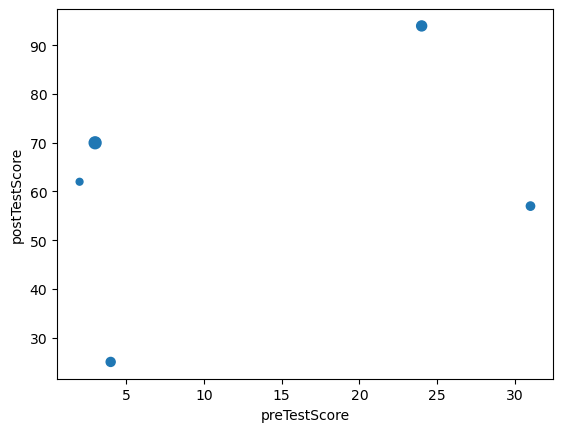
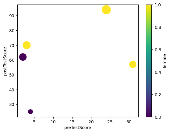
Step 4. Create a Scatterplot of preTestScore and postTestScore.
This time the size should be 4.5 times the postTestScore and the color determined by sex
In [4]:
df.plot.scatter(x='preTestScore' , y='postTestScore' , s=df['postTestScore']*4.5 , c='female' , colormap='viridis')